By Nick Butler
Tags: Agile , Design , Development

In this post you’ll learn about an Agile design process that saves time and money — and delivers products your customers will love to use — by cutting the cost of change.
Agile works on the principle that change is the one constant in software development. As you build your product, and watch your customers putting it through its paces, your understanding of what these customers need will change. So how do you respond to this change, while still creating an elegant, cohesive user experience?
When Boost’s founder Nathan Donaldson was embedding Agile at Boost, he noticed that much of the guidance on the subject was silent on how design fits in with Agile software development. “Design happens. That was the long and the short of integrating design into Agile,” he says.
Since then, we’ve been experimenting with different design processes until we’ve found one that works, both for the Boost crew and for our clients.
“Seeing the Boost team work together was really cool, because I’ve never seen design work so well with development.” — Matt Allen, Digital & Visual Media Adviser, Creative New Zealand
Our Agile design process cuts the cost of change by maximising the work not done.
Our designers and developers — along with the Product Owner — collaboratively build lo-fi working wireframes. These are regularly user tested. Once the bulk of the features are in place we complete a UX review. This and the user testing guides our graphic design phase, during which we create the cohesive brand and user experience.
In other words, we first focus on how the product works, then on how it looks.
So here are the key elements of our Agile design process:

The monochrome look of our lo-fi wireframes gave rise to a nickname: 50 Shades of Grey.
Descriptive maybe, but misleading. Unlike the literary phenomenon from which it takes its name, our process has no time for bondage. It’s about avoiding the pain that comes from being tied to a plan.

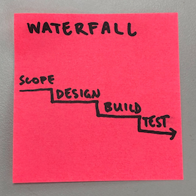
We knew we had to get away from Waterfall. Designing the whole site in one big, up-front phase just doesn’t work. You can’t build in what you learn as the project progresses.

“The crossover between what’s actually needed and what’s imagined at the start is quite low. I’d put it in around the 20 percent range,” says Nathan.
As a result, you end up designing lots of things you never need, and don’t get the chance to do much of the design you do need.
The first approach to integrating design into Agile development that Nathan looked at was the Washing Machine model. This suggests you do design and development as a series of short iterations within larger iterations.

In practice though, this just turned out to be Waterfall by another name. “You still had stuff getting thrown across the divide,” says Nathan. Silos developed and the team was no longer cross-functional. The team’s productivity dropped as the movement of each batch of work through the process caused a blowout in work in progress.
Here’s what we came up with instead.
We normally start with a discovery workshop. This gives us an idea of how our product will improve our customers’ lives and an initial plan for how to deliver these benefits.
We start writing user stories or refining those from the discovery workshop. We’re aiming for stories that follow the INVEST criteria (stories that are Independent, Negotiable, Valuable, Estimable, Small, Testable).
In particular we want to work on the smallest vertical slice that lets us deliver value to the customers. We don’t, for example, design an entire app, then develop this design, then integrate this code. Doing that would delay getting something we can test with our users. Instead, we pick our top priority customer benefit and design, develop and integrate this in a single Sprint. Then we move on to our next highest priority stories.
For example, if you were building a website for a movie theatre, you might start with a one-page site that lets customers find the theatre’s details — name, key selling point or slogan, address and contact deets — so they can decide if they want to go there.

Designers and developers work together on these stories. And they also work closely with the Product Owners. At any time here in the Boost studio, there’s usually a conversation going on between designers, developers and Product Owners.
Face-to-face discussion keeps the process transparent, unearthing misunderstandings and quickly clearing blockers.
The collaborative process also helps build T-shaped skills. It adds a broader spread of capabilities to a single pillar of expertise.
The designers and developers build working wireframes. These are lo-fi, greyscale versions of the product. Crucially, they are also working software. If worse came to worse, we could go live with these at the end of the Sprint.
This means we’re concentrating on the functionality and usability. At this stage we’re aiming to develop software that makes it as easy as possible for the customers to get the benefits spelt out in our user stories. Form follows function.
So when we’re putting the product through its paces, people don’t even notice the design, they home straight in on the functionality. This helps avoid distraction in user testing, and Product Owners find that it helps them show their stakeholders what’s being achieved, in Reviews for example.
We simplify creating these working wireframes by using off-the-shelf elements from existing libraries or frameworks. For example, the designer might open the Foundation framework in Sketch and then drag and drop the different components into the design, moving them round to create the optimum layout. The developer can then easily implement this design in Foundation.
Of course, where off-the-shelf components won’t meet the acceptance criteria, we tweak existing ones or custom-make what’s required.
At least every month, and usually every Sprint, we put our working wireframes in front of representative users to check if what we’ve built will deliver the planned outcomes.
What we learn feeds into future user stories and into our UX Review.
Testing is vital for getting the value from this process. There’s no point of cutting the cost of change if you’re not going to gather the insights that drive the change.
About three quarters of the way through the project we complete a UX review.
By now the bulk of the features will be in place. Plus the information architecture of the site or app should be well-developed. As a result, we can take a step back and review the big picture. We can identify any gaps in the user flow. We can make sure the product provides a consistent, and consistently good, user experience. And we can also resolve issues identified earlier in design reviews, Sprint Reviews and user testing.
We now know enough about the product to complete the hi-fi graphic design. We bring in things like colour, imagery, fonts and a consistent look and feel for interaction elements like buttons and forms.
Our brand research guides a design that creates the response in the users that our clients are looking for.
We sometimes talk about this as the emotional design. However, all our design work so far has also focused on an emotion: satisfaction. If the site isn’t easy to use it will be frustrating. And that’s not high on the list of desirable attributes for any brand.
This is one of the rare times we write design-only stories. That’s because this is when the design gets signed off by the client. Since changes are likely, we prioritise limiting the cost of these changes over delivering working software.
These hi-fi graphic designs show the product pretty much as it will be, not the early, invariably inaccurate, guess. This means the Product Owner is only getting sign-off on designs for what’s actually being built. “You can spend a lot of time arguing about the right colour for something that’s never going to get built,” says Nathan.
Once signed-off, the developers implement these designs. Now’s the time for a pixel-perfect rendition.
By saving up the hi-fi design until we have a good idea of the product, we’re able to create a cohesive experience that satisfies the needs of user and brand.
The process changes how Product Owners work with stakeholders. You need to get buy-in on the approach. And you often need to reiterate how and why the process works throughout the project.
As we’ve already mentioned, the process in many ways simplifies working with stakeholders because you can show them working software and you need only get feedback on designs for features that need to be built.
As you’ll work closely with the designers and developers, it helps if you can be co-located with them. At any time, we almost always have a Product Owner or two ensconced at Boost.
Developers get to focus on functionality early. You only have to do the fiddly hi-res implementation for features that actually are needed. And there’s less rework of these hi-res renditions. This work is also quicker and cleaner because your CSS don’t grow haphazardly over time.
To make the hi-res build even simpler, you’ll be thinking in terms of reusable components — types that can make it easier to apply a design to the whole website — even when you’re building custom elements.
It’s a new process for many designers, and it takes a leap of faith to make it work. When you do, you get big benefits.
“Talking with the designers, they really like having everything in front of them and being able to design it in a cohesive way,” says Nathan.
You wouldn’t start building a house by hanging wallpaper and putting down carpet. While things like plush pile underfoot can make a huge difference to the pleasure you get from your home, they don’t achieve the house’s key purpose of keeping out the rain.
In the same way, Boost’s Agile design process starts with the functional frame of your product, before integrating it into an elegant whole that makes it a pleasure to use. You get to work faster, using your budget only for what’s needed. And, as a result, you get more gain for less pain.
We’re putting together a visual summary of this process. Email us if you’d like us to send you a copy when it’s complete.