By Nathan Donaldson
Tags: Agile , Design , Development

Your blog gives you a chance to share your work in a more in-depth and meaningful way. You can share your process, your knowledge and constantly communicate and grow with your community.
If you’re going to have a meaningful presence it should not only contain great content, it should also look great.
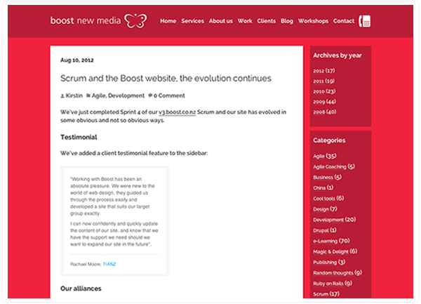
About 2 months ago our MD, Nathan came to me and said the current blog design needed to be less red. I sat at my desk and looked at it for a good while. A simple cosmetic change wasn’t going to be enough to mend this broken heart. I decided what the heck, I’m going to completely redesign the Boost Blog.

Any spare time my developer colleague Sam and I had was spent working on the new blog design with a focus on:
To make our blog a more readable experience I threw away the alarming amount of red and instead used color to draw your eye, highlight and show relation between the elements. I focused on subtlety and slight tonal differences (your eyes can relax now) to create a design that is much more calming and approachable.
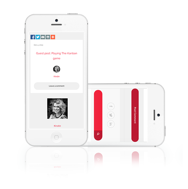
Our blog is now fully responsive to work on any browser width, with a focus for mobile, tablet, desktop and also those with an abnormally large bowser window.

We also wanted to highlight the hardworking and passionate Boost team by giving each blog author a profile image and small work bio ( these will drop down when you click on their beautiful mug’s) to make the blog just a little more personable.
I am really happy with the new blog! I believe we’ve created something pretty… well, pretty.
We hope you enjoy the new blog and we’d love to hear your feedback on it via the comments! : )